How to interpret a chart?
Interpreting a chart depends on the type of chart and the information it contains. Here are some general tips for interpreting graphs:
1. Understand chart types:
Different types of charts represent different types of data. Common types of charts are line charts, bar charts, pie charts, scatter charts and histograms. Understand what the graph means and how to read it.
2. Consider the axes.
A chart usually has two axes, an x-axis and a y-axis. The x-axis represents the independent variable and the y-axis represents the dependent variable. Make sure you understand what each axis measures and what units of measure are used.
3. Spot trends:
Look for patterns or trends in your data. For example, if you’re viewing a line chart, look for an uptrend or downtrend in the line. When looking at a bar chart, look for differences in bar height.
4. Look for outliers.
Outliers are data points that differ significantly from the rest of the data. Look for data points that deviate from the rest of the data and try to understand why they differ.
5. Compare different parts of the chart.
If your chart contains multiple series or categories, compare them to each other. Look for differences or similarities between them.
6. Consider your context.
Finally, consider the context in which the diagram was created. Who created the chart and why? What is the source of the data? Understanding the context helps you interpret the charts more accurately.
Example of Pie Chart Interpretation
Indeed, this is an example of interpreting a pie chart:
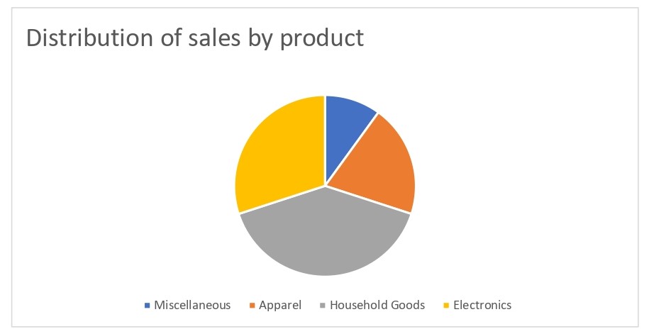
Suppose you are looking at a pie chart showing the distribution of sales by product category for a particular company. The table consists of four sections: Electronics, Apparel, Household Goods, and Miscellaneous.

1. Understand chart types:
This is a pie chart used to show how the whole is divided into parts. Each section of the cake represents a different product category.
2. Look at the label:
The pie chart labels are Electronics, Cultures, Household Goods, and Miscellaneous. This will give you an idea of what each section of the pie chart represents.
3. Look at the slice.
The size of each segment indicates the percentage of sales that each product category represents. For example, if your electronics slice is the largest, you can assume that electronics sales account for the largest percentage of your company’s total sales.
Four.
4. Look for patterns:
Look for patterns or trends in your data. For example, if the Other segment is very small, it may indicate that your company doesn’t sell many products in that category.
5. Compare slices.
Compare the sizes of different disks to each other. For example, similar sizes for the “Apparel” and “Household Goods” segments may indicate that these two categories are equally important to your company’s sales.
6. Consider the context.
Consider the context in which the diagram was created. Who created the chart? What time period is covered? Is the data accurate and reliable?
Overall, interpreting a pie chart means understanding what the chart represents, analyzing different sections of the chart, and considering the context in which it was created.
Bar chart example
Indeed, here’s an example of how to interpret a bar chart.
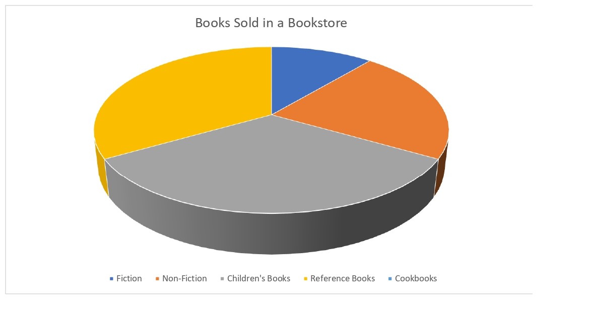
Suppose you are looking at a bar chart showing the number of books sold in a bookstore by different categories. The chart has five bars labelled Fiction, Non-Fiction, Children’s Books, Reference Books, and Cookbooks.

1. Understand chart types:
This is a bar chart used to compare different categories or groups. Each bar represents a different book category.
2. Look at the label:
Bar labels are fiction, non-fiction, children’s books, reference books, and cookbooks. This will tell you what each bar represents.
3. Look at the height of the bar.
The height of each bar indicates the number of books sold in each category. For example, if the fiction bar is higher than the other bars, you can infer that the bookstore sells more fiction books than any other category.

4. Look for patterns:
Look for patterns or trends in your data. For example, if the bars for “children’s books” and “cooking books” are similar in height, these may indicate that the two categories are equally popular with customers.
5. Compare the bars.
Compare different bar heights to each other. For example, if the “non-fiction” bar is slightly shorter than the “fiction” bar, it may indicate that non-fiction is also popular with customers.
6. Consider the context.
Consider the context in which the diagram was created. Who created the chart? What time period is covered? Is the data accurate and reliable?
Overall, interpreting a bar chart means understanding what the chart represents, analysing the various bars, and considering the context in which it was created.

